ShopDreamUp AI ArtDreamUp
Deviation Actions


Suggested Deviants


Suggested Collections


You Might Like…


Description
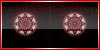
For OtherWorlde's group icon contest/avatar. The picture is taken from the group's Landscape Setting gallery folder (so official/authentic illustrations).
At first, I've considered making an animated icon only with the logo + name of the RPG Site, but I've figured out it's too common and mainstream among groups nowadays...
tbh I just wanted to apply what I've learned in my university's Marketing classes ... This is the first time I try to apply a marketing & advertising strategy on a group icon :'D
I hope I did an acceptable job in front of all those beautiful and competitive entries. c':
On a side note, it was a very hard work to make it again less than 30 KB. 29,95 KB was my gamble and I think I've managed to do it, haha. :'D
At first, I've considered making an animated icon only with the logo + name of the RPG Site, but I've figured out it's too common and mainstream among groups nowadays...
- The aim of a group icon is to awaken curiosity in people's minds, so that they'd click it and see what's behind it (bonus points if the icon makes synergy with the tagline).
Otherworlde's tagline goes straight to the point and it's best for such DA Groups... Yet there are also many RPG Groups out there with same "animated logo icon" concept (also often pixel art), which leaded me to think of a different idea. Like if we were to put all group's icon one near another, OtherWorlde's would stand out among all of them.
- That's how I thought about an intruiging door that open in a fashionable way and lead to the "main hall (?)". After that we'd finally get to see the classy logo. I judged that this is the best way to make people who'd see the group icon somewhere on DA be at the epitome of curiosity; and so can't help but see what's inside those doors.
Just imagine you're a random deviant, and you fall into a beautiful deviation. When you get to see the groups' list this picture was submitted to (or even the artists' description), you'll find this icon and "Academy of Dark Arts" under it.
With an intriguing icon and OW's tagline, the deviant will be tempted to click and at least see how the group's like in this inside (metaphor in the icon: the open doors that lead to the main hall :'D ). The rest is up to the group's overall design to attract more the visitor.
It goes without saying then that it's an RPG Group with promising concept, plot, and interface. At least this is how I imagine the situation of the potential future members. I hope my vision would be right.
The "main hall (?)" stock was chose specifically for its intriguing atmosphere. Plus, I got inspired from OtherWorlde's tumblr, where you can see an old splash page layout (which is still the best for me, as I've just discovered about the RPG site from the contest).
The RPG group & website's official illustrations, design, global look and description have a calm, yet dark atmosphere; kind of "the calm before the storm" feel (?). I tried my best to follow this global atmosphere...
I hope I did an acceptable job in front of all those beautiful and competitive entries. c':
On a side note, it was a very hard work to make it again less than 30 KB. 29,95 KB was my gamble and I think I've managed to do it, haha. :'D
Image size
100x50px 29.3 KB
© 2014 - 2024 Judiette
Comments0
Join the community to add your comment. Already a deviant? Log In